Truth be told, I first heard of this index some 15 minutes ago when I received an email from good old Bob.D. So I googled it and read the entry in Wikipedia.
“The Value Line Geometric Composite Index is the original index released, and launched on June 30, 1961. It is an equally weighted index using a geometric average. Because it is based on a geometric average the daily change is closest to the median stock price change.
The daily price change of the Value Line Geometric Composite Index is found by multiplying the ratio of each stock’s closing price to its previous closing price, and raising that result to the reciprocal of the total number of stock”
Can’t say it made me any wiser 🙂
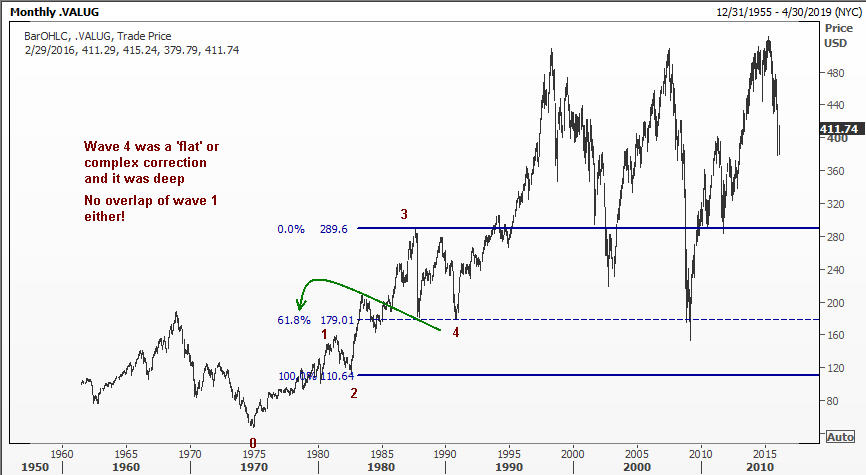
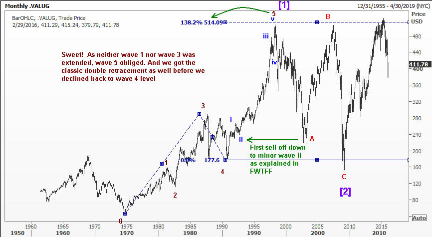
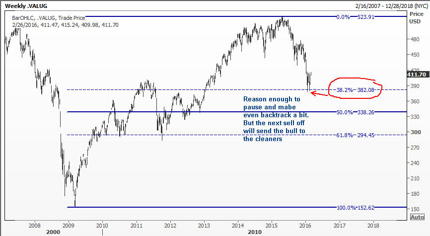
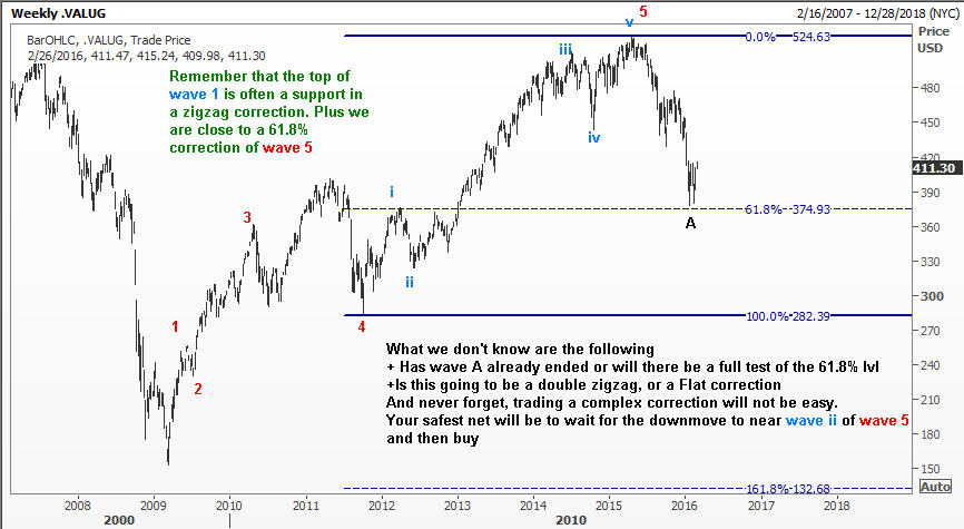
But a look at the charts was quite revealing, and I am happy to share them with you.
I suggest that you open each chart in a new tab so it will be easy to go back and forth. Like always, my comments appear on the charts themselves and so I won’t add any more fluff. Enjoy and share with friends.
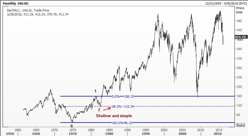
This first chart is a monthly chart going back almost to the time I was born. Pay attention to the time frame and the color coding that will help you spot where we are in the progression.